MOST: Make, Organize & Storage Tray
Introduction
(originally from here)
MOST (Make Organize & Storage Tray) is a system for helping students and teachers spend more time MAKING than setting-up and cleaning-up when they use a Makerspace. This is specially true when a full class is using a limited space, with limited amounts of time and people to manage the space.
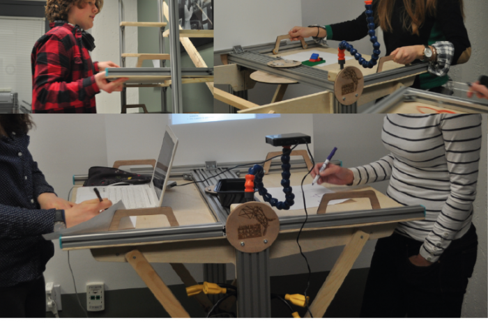
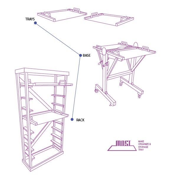
The design is composed by three parts: TRAYS / BASE SUPPORT / STORAGE RACK. In this site we display how a first prototype was made, how its being currently used and how you could build your own MOST.
Process
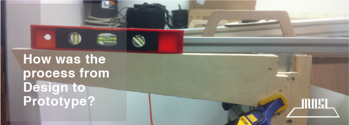
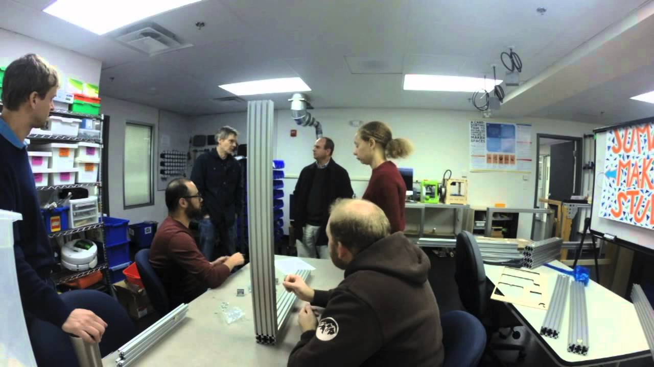
MOST started as a set of observations of Educational Makerspaces, looking at how people interact within them and what type of needs they had. From this point different ideas could be explored with more details, balancing needs, materials and prototyping processes. The following video summarizes the process from Design to Prototype.
A Sequential Workflow of Makerspace Usage allowed to visualize that users move around Makerspaces in the effort to complete their projects, therefore the design concept of MOST were to shift from “stationary tables” to a “dynamic set of surfaces”.
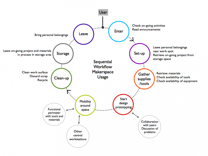
Figure by L.Madariaga, based on “Contextual Design”, Beyer & Holtzblatt, 1998
Build your own MOST
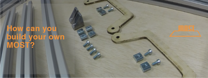
You can start building your own MOST using a set of commercially available materials. Take a look at an instructable of how to start off building the TRAY.
Usability Study
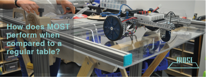
During February through March 2015 an exploratory study was conducted at Jumbo's Makerstudio, our experimental Makerspace at the Center for Engineering Education and Outreach, Tufts University.
The goal of this study was to evaluate the usability and user-experience of a new type of standing workstation-system to be used in the context of an Educational Makerspace. Thirty participants were asked to perform two design-based activities allowing them to use a setting composed of the new workstation and one formed by a standard table and seats. Participants were asked to rate each setting using a System Usability Scale (SUS) Questionnaire and to score them by using a comparative rating with respect to different dimensions of the user experience. The results display a favorable Usability scoring for the new workstation (Mean= 78.5, SD=12.03) when compared to the traditional setting (Mean= 67.3, SD=12.83). Subjective evaluation of the new workstation also displayed significant scoring of its capacity for easier set up and clean up tasks. Participants perceived the design as helpful to keep materials and projects more organized. (If you have more interest in the details: check out the full presentation of the study at the bottom of this page)
Selected quotes:
I really liked the storage idea. For many Makerspaces, students come and go as they need to, the hours are less regular. It's so crucial to have a place that is all my own that I can access very quickly and easily. Having the shelves turn into work stations is a great solution to that. Also, in this environment, when a maker is moving from machine to machine or back to their computer for adjustments or checking the various projects going on, they are very active. It is much more practical to be standing up at the standing up at the workstation so moving around and switching tasks is easier
Valued aspects: Storage/Mobility/Standing/Projector size and location
I liked the standing position for more fluid work. It was easier to transition between going to the materials bin, back to the workstation then to other parts of the room to test out the designs.
Valued aspects: Standing position/Mobility
It was MY space, I could leave things there and I like standing up when I work and being able to leave my workspace quickly and easily.
Valued aspects: Easy storage/Mobility
USABILITY STUDY from Leonardo Madariaga
Acknowledgments
Center for Engineering Education and Outreach, Tufts University
www.ceeo.tufts.edu
Jumbo's Makerstudio
http://maker.tufts.edu/spaces/maker-studio/
